

Test your website for Responsive Design
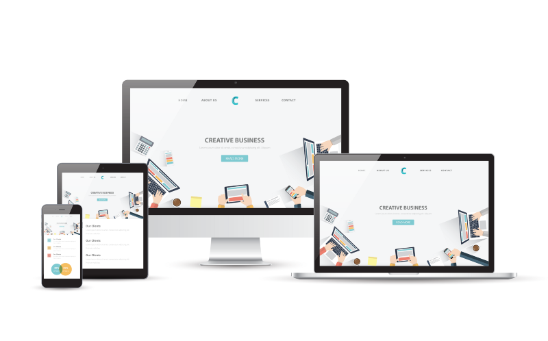
“Responsive web design is a web design approach aimed at crafting sites to provide an optimal viewing experience — easy reading and navigation with a minimum of resizing, panning, and scrolling — across a wide range of devices (from mobile phones to desktop computer monitors).”
With the proliferation of mobile devices such as smartphones, tablets, and phablets, it is becoming increasingly important to develop responsive websites that can handle different screen sizes and orientations. Even on desktops and laptops there also exists many different screen sizes and browsers with varying handling of the CSS and HTML standards.
The major CSS frameworks, such as Foundation and Bootstrap, are great starting points for building responsive websites. You still need manual browser testing though to make sure your design works well across major mobile devices and browsers. This becomes more of a problem as some developers only test their sites on browsers and a few mobile devices that are available to them.
Even Microsoft that is often criticized for not following web standards is aware of this problem. Hence they created a useful site called modern.ie to help developers test their CSS against IE and other browsers. They provide tools (screenshot tool results for LED Technica) and reports (sample report for LED TEchnica) to help web designers and developers detect common compatibility problems and prevent their users from getting the best possible experience on a webpage.
They also offer free trial link to one of the better known browser testing platforms — BrowserStack. While useful to test a website against various OS/browser combinations, BrowserStack is a paid service after the free trial. With their lowest plan starting at $39/month, you might want to consider a cheaper option though. One alternative is the Browser Shots. It “is a free open-source online web application that provides a convenient way to test a website’s browser compatibility in one place”.
While testing the responsive design for a website a few months ago, I signed up for BrowserStack. After using it for a while the biggest issue I had was that it was very manual. Each time I needed to test, I had to submit a request and wait to get the results as image files. I also needed to submit a separate request for each page I wanted to to test. Granted they have a plan called Live, which would have allowed me to test the site live on various browsers, it seemed like I needed to connect to various virtual machines to do so.
So imagine my excitement when I came across Responsinator — a simple yet wonderful service! In their own words “Responsinator helps website makers quickly get an indication of how their responsive site will look on the most popular devices.”
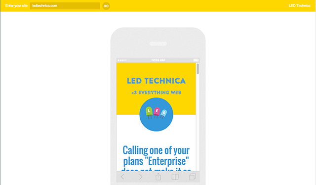
You can see a quick demo of me checking an article I recently posted on an iPhone 5 screen below:
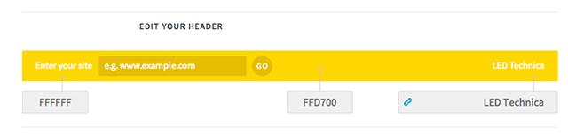
For $60/year, you can even customize the top bar with your company name and colors using a very simple interface, which is great if you like to share your design with your customers and have them test it on various mobile devices.
While it is definitely more interactive and faster to get feedback, a big caveat as mentioned in the Responsinator FAQs is that “Responsinator is an emulator. It does not precisely replicate how your site will look on all the displayed devices, for the best testing use real devices.” So if you are one of those pixel perfectionists Responsinator might not be for you. But if you just like to get a feel for the site on a mobile emulator or provide your clients with a more engaging way to interact with your design and provide you feedback, you might want to give it a shot.